At home
Analyses from a training game

We are in pre-season again after the winterstop and that means the ladies are back into outdoor training and a series of oefenwedstrijden. These training games help shake off the indoor dust1 and allow us to focus on honing established tactics and perhaps tweak a few things that might need some attention. This is important for me particularly as this is my first season with the team and the list of areas to work on is quite long.
Last week we had the first of these training games and I thought it might be interesting to show you some of the outputs collected from the game that are shown to and discussed with players. The match was played against a team that is at a slightly stronger level and for both of us this is the first game after the winterstop played on chilly midweek evening.
We won 2-1 which was good but my estimation was that it could have been a lot more comfortable given the chances we created. I am notoriously bad at instant assessments from the sideline, worry about whether I am looking at the right things, whether I am having my head turned by the most recent or eye-catching aspects of the game, so it is important to go back to the video and impartially analyse what actually happened.
One emphasis for this pre-season was to address some inconsistencies in our pressing and focus on making good decisions after winning the ball. Some of the inconsistencies arise from the team’s lack of experience playing the sort of press shape I’ve implemented, learning to recognise key pressing moments as they develop as well as trusting team mates - cohesive pressing is about groups of players acting together2.
As an illustration of the kind of data I put together I’d want to know about the three stages of the press, where the opponents started from, where we won the ball and where we returned the ball to, and then summarise that in a broad visual output. Here we are only interested in situations when we had time to set a high, organised press. Quick transitions to defence and defending in our half weren’t included, those would be different analyses.

Naturally most of the examples came from our opponents free-outs (free-outs..? the old 16 or uitslaan, or whatever we are calling it now) and that explains the thin line of restart positions in the left hand image. Where we won the ball is interesting, the cluster on the right (our left - we are attacking the goal at the bottom of each image) is good, the ball was won in the attacking third 63% of the time from these restarts and 76% of the time in the opponents half. Another point of interest is the different concentration of ball winning between the left and right. On our left the cluster is in a relatively small area (half the high ball wins occurred here) whereas on our right the ball wins are more spread out and include a number of sideline restarts. These are largely due to our opponents trying to escape from pressure with longer, lateral balls.
These visual outputs are good, the end position looks excellent. But we can’t rest on our laurels there. We need to examine these ball returns and see which were actually effective.

Dark circles in Figure 2 are us returning the ball to the circle after winning it from an organised press but having the circle entry pass intercepted. I include these, though they would not be counted as classic ‘circle entries’ because they not only show good intent by the team but also because there are opportunities for re-winning these balls even if the circle entry pass doesn’t quite come off. Red points are successful circle entries - us in possession of the ball - and the open darker red circles are effective outcomes, shots at goal or penalty corners won. We can summarise all this by saying that 21 of the 39 (54%) organised pressing events returned the ball to the circle, and of those returns 14 (67%) ended up in our possession and 8 had effective outcomes. Now that is a crude summary. While it provides some information it can also be misleading if not seen a wider context. The extra and very necessary step is to see how these tweaks to our pressing behaviour may have changed our success rate compared to previous games. And I’m not showing that because it would fill more than the rest of the article. If I did it would be a mix of some spatial analysis comparing pressing outcomes across matches as well as combining and comparing outcomes to test whether there are any real improvements.
A much more immediate kind of feedback can be found if we leave the pressing side of things and stick to chance creation, both ours and our opponents. We don’t want to just count shots or look at where shots were taken because that doesn’t give us very much information. We want to look at the quality of the shooting chance by estimating the expected goals value for each shot.

There is a clear mismatch between both the number (24 shots vs 4) and quality of chances we created compared to our opponents (compare the circle sizes). The accumulated xG values shown in the bottom lefthand corner of Figure 3 suggests we should have been looking at between three and four goals from all these shots whereas our opponents were fairly well contained.
Shots are not the only way of scoring of course so it is important to combine this information with other positive outcomes from circle entries. To do this we include corners and penalty strokes awarded (xGplus). We also assess which of these chances is a high values chance (I talked about this here) because it says something not only about the quality of the chance created but the decision to take that chance.

A quick explanation of what you are looking at. Here is the distribution of all shots taken, penalty corners and penalty strokes won. Shots that didn’t score are in grey and goal scoring shots are in orange. Points enclosed by an orange circle are “big chances” - opportunities that cross a threshold of scoring probability to become high value chances. Penalty corners and penalty strokes automatically are counted as high value chances.
Overall we added another two expected goals when the corners and penalty stroke we won were included. Our opponents added two high value chances both of which were from winning corners in their attacking left of the circle. What’s nice to see is that of the 29 opportunities we created in the circle over a third of them were high value. What clearly needs improving is the conversion of more of those chances to goals since our xGplus was three more than we actually scored.

Players always want to know how they performed individually of course and that is also something to keep track of. Figure 5 shows the players who were involved in the opponent’s circle and the xGplus of that contribution. Here for example, the large circle for Player 9 (xGplus = 0.8) is because she won the penalty stroke. And I say won advisedly - she had beaten the ‘keeper and was in the process of scoring when she had her stick hooked by a defender. Player 9 then gets the value for a penalty stroke but so also does Player 2 because as well as the other contributions she made, she actually took and scored the stroke.
We can convert this information into what we might expect per circle entry (xGCE), a metric of efficiency. Of the 51 circle entries we had, 29 were converted to chances (57%) and 22% of these were high value chances.
Finally we always look at the larger in circle picture, the network of connections made by the players and their outcomes for both teams.
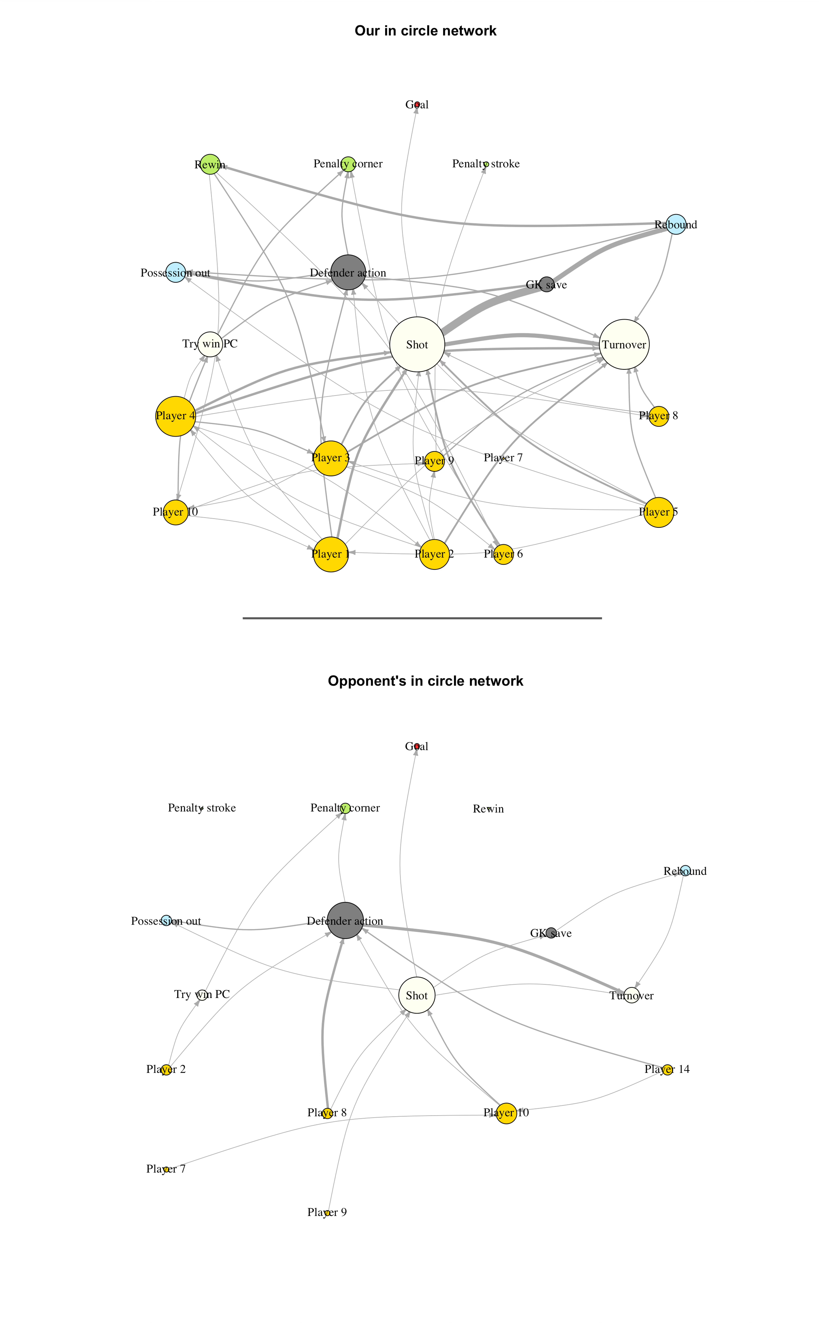
Circle size is related to the amount of connections, line-width the amount of traffic. This whole game network is a little confusing if you are not used to it but it isn’t difficult to pick out some salient points very quickly. For example, we made their goalkeeper work hard (and she did have a very good game against us) as can be seen from the thickness of the line leading from ‘Shot’ to ‘GK save’ and from there to ‘Rebound’. And the comparison between the complexity of our network and our opponent’s is quite stark.
While visually there is a ‘quick hit’ from these diagrams the most important part is the underlying probabilities. We can ask not only the direct probability for each player of, say, taking a shot, re-winning the ball after a save or connecting with another player, but also what the probability of a player contributing to a shot taken by a team mate. This is because the underlying model looks across all the connections not just directly between the points of interest but also those flowing through team mates to actions and outcomes. This information can be simplified in a number of ways.

For example, here is Player 4’s specific network extracted from the whole game network in Figure 6 (with a couple of tweaks). Visually one interesting thing is that all her connections with team mates ended directly in turnovers. So while her shooting was good, all low value shots but ones that forced the ‘keeper into a save each time, how she facilitates team mates might be something to keep an eye on.
You’ll note there are no defending metrics here except by proxy in the sense that what attacking success our opponents have is a reflection of our defending success (or otherwise). Defending is difficult to assess. One can track tackles and interceptions and, in a similar way to xG, build models that help evaluate individual actions. But as Paolo Maldini said “if I have to make a tackle, then I have already made a mistake” which implies that a great deal of defending is not about clear actions but about the more subtle art of space control, out of contact pressure and collective movement. Something I have to work on to create some meaningful metrics for the defending side of game.
As we come back into competition and the dataset builds further for the team I’ll revisit some of these outputs. I’m particularly interested in how the spatial side of things might help identify pressing success so expect to see more detail extracted from visualisations like Figure 1 in a future article.
Though I seem to be regularly reminding players of the many cross-over points in skill and small team tactics worked on indoors that come up again now we are outside.
One of the things I do is show players video of starling (spreeuw in Dutch) murmurations or shoaling fish. Group cohesion in flocking, herding, shoaling animals has a lot to do with paying attention to your immediate nearest neighbours - when and where they move dictates when and where you move. For these animals it is often life or death (see if you can see the falcon in the linked video) but for hockey coaches, well, it is more important than that.