Introduction
During a talk on Ernst Baart’s the Hockey Site I outlined the process of developing an expected goals model. These models are common in other sports especially football but have been little used or developed in hockey.
I don’t want to go in to too much detail here because I actually want to show just two graphs from some of the data from the Olympics. But a quick background is probably useful. An expected goals (xG) model is essentially a way of predicting the probability that a shot will become a goal. It’s a statistical approach of adding values to shots based on certain parameters the modelling process identifies as having an influence on whether any particular shot is likely to score. As such, these models provide more information than solely the position of the shot in the circle or the shot’s goal conversion rate.
Some xG examples
Here for example is the shot distribution for one of the Dutch forwards, Freeke Moes, from the pool games at the last Olympics. The position of the point is where the shot was taken from and the size represents the probability the shot will become a goal - the larger the point the higher the probability.
It’s possible to add the actual values to this distribution.
And this does make the the probabilities more tangible, but obviously when dealing with a lot of shots adding the value to every shot can can lead to very messy visuals.
We can use this kind of model to compare a players performance across a variety of scales: within game, between games, between tournaments etc. For example, here is Freeke Moes’s shot data from the Olympics (as above) compared to how she performed in last year’s European Cup.
And naturally we can do this for the whole team and all sorts of team comparisons both within and between tournaments. I won’t go into more detail as I want to add a couple of the knockout games that aren’t in this dataset. When that’s done it will be worth examining goal scoring performance of both players and teams in more detail.
A summary of shot and xG performance
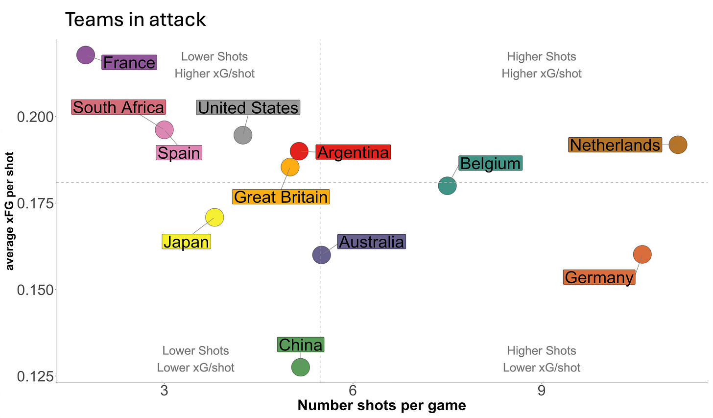
For now I just wanted to show these two images which are summaries of team performance from the Olympics using shot and xG data. I’ve done this for both when the team is attacking and also when they are defending. Here is the attacking figure.
The graph is divided into four areas. The vertical dotted line is the average number of shots per game for all teams and the horizontal dotted line is the average xG per shot for all teams. These lines divide the graph into four general areas. If a team falls into the bottom left they generally took fewer shots at a lower xG value and teams that appear in the top right area took more shots and had a higher average xG value. The other two areas, top left and bottom right, are the intermediate combinations of the two metrics.
It is no surprise really to see the Netherlands in that top right square - they took the highest number of shots per game although their xG value per shot is a little lower than some nations. But since they are often attacking crowded circles maybe that is not a surprise. Their opponent in the finals by contrast had considerably lower number of shots per game and the lowest xG value suggesting that China’s quality or choice of shooting opportunity wasn’t that good.
What else is notable is the high xG values for the teams that did not make it through the knockout stages. Weaker teams often get their opportunities via fast breaks or quick transitions that lead to an attacker with just one defender or even just the goalkeeper in the circle. These are situations that result in higher goal scoring probabilities and are reflected by the fact that the USA, France and South Africa are all present in the top left hand corner - they don’t create many chances but they are good chances when they do.
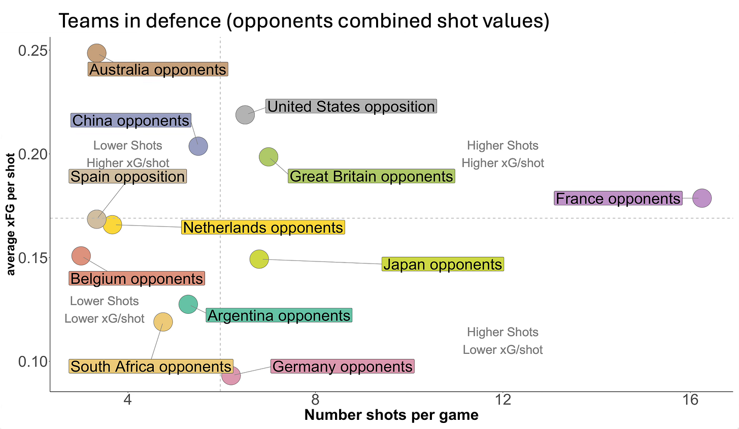
If we turn this round and ask what the opponents of each team managed to do against them we get this distribution.
What one would look for is whether any team can combine good attacking metrics (in or near the top right quadrant in Figure 4) with good defending metrics (putting their opponents in the bottom lefthand corner in Figure 5).
Belgium did this very well having one of the best defensive records at the Olympics., South Africa also did well defensively especially for a team that was one of the weakest in Pool B and this is shown, aside from their game against Argentina, by them losing by just one goal in their other four games.
Australia is something of a surprise (as I’ve mentioned before). They did restrict the number of shots taken in line with three or four other teams but the quality of shots they conceded suggests they offered what football calls ‘big chances’ to their opponents. The Australian coach Katrina Powell didn’t give much away in her talk on the Hockey Site recently, praising her teams ability to score field goals and defend corners, but said little about the areas in which they were less competitive. This may be another data nudge suggesting that some aspects of their game didn’t match up to the other teams that went deeper into the tournament.
Germany limited their opponents average shot probability to just 9%, an impressive result and perhaps their in-circle defence compensated for some of the previous analysis that showed that relative to other teams, they were not as good at preventing entries into their own circle.
That’s enough for now. It’s fun to look at and you can pick among this data and speculate about each team’s position in the two figures but, as mentioned above, this data, in combination with penalty corner, penalty stroke and expected threat estimates, will ultimately be used for a more comprehensive assessment of in-circle play for a few selected teams.


