I recently gave a series of talks on Ernst Baart’s The Hockey Site about statistical analysis for hockey that extended into some analyses of games from the Olympics. One of the outcomes of the more specific analysis was that possession appeared to be an interesting metric for predicting circle entries and ultimately winning teams. This was something of a surprise and so in this post I thought I would summarise that analysis in a little more detail.
Possession in hockey is a strange thing. One might expect there to be some comparison to football. On the other hand, and with the way hockey has developed over the last ten to fifteen years, perhaps the game is now so different to football that any comparison is largely irrelevant.
As a coach I’d like to find that possession is measurably important because, as another coach once teased me, I have an affinity for pretty passing patterns, a game aesthetic that is nice to conjure in a team one is coaching but that admittedly can get in the way of the proper process of efficiently beating the opposition. Indeed, some of the limited possession related analysis I had done suggests that teams can have the ball for considerably less time than their opponents and still trounce them. A case in point would be something I wrote before showing Spain had significantly more links in their possession chain but their opponents Belgium still won, 5-0. Such a pattern might occur rarely (though see below) and is akin to say, Manchester City losing a game with 70% possession. The naysayers of the heavily possession based approach, the steady strangulation of opponents by a thousand passes, jump on these isolated results as evidence that possession isn’t all its cracked up to be, conveniently ignoring of course, all those times when it is and Manchester City win another title.
For hockey, a fundamental first question might be, is there variation between teams in the amount of possession they have? To get an answer it’s possible to use the data that was collected during the Olympics. Here I am looking at the women’s game only. Possession was originally expressed as a percent for each team for the game as a whole. Percentages can be tricky to analyse so here I’ve converted them to the number of minutes each team had the ball per game. And at this stage interest is focused on just the pool games. So, is there variation between teams?
Yes, there is. This might not seem much but the subsequent analysis confirms that some teams really do keep the ball longer than others.
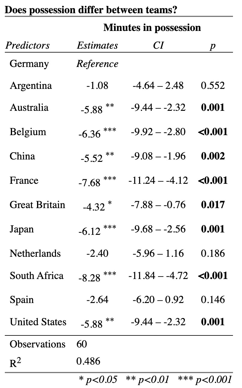
A quick explanation of the table is probably warranted here. The analysis is comparing the amount of possession each team has to the nominal reference team. In this case I have made Germany the reference team because they appeared to have one of the highest possession values from Figure 1 above. Any team with a probability value of less than 0.05 (the right hand column headed ‘p’) is considered different, that is the team in question has either significantly higher or lower possession value than the reference team - Germany. The result can also be seen in the ‘Estimates’ column where the number of stars indicates the degree of difference. The sign of the estimate shows which way the difference goes. Negative estimate values indicates the team had less possession on average than Germany and positive values indicate more possession than Germany.
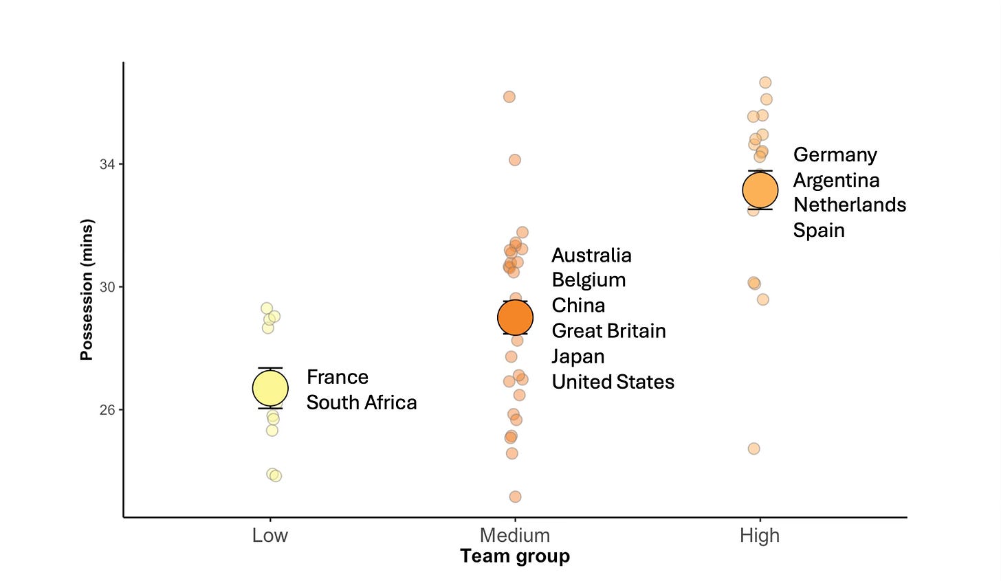
What can we glean from this? Well, since there is no team with a positive estimate all teams on average didn’t keep the ball as well as Germany. In addition, it’s clear there are three teams that had similar possession values to Germany: Argentina, Spain and the Netherlands. All the other teams hung on to the ball for less time. Now, in analysis the desire it to end up with the most parsimonious model so here we try and simplify the results into discrete groups.
It’s possible to see now which teams differ from one another more clearly. At the low end are France and South Africa who keep the ball about 45% of the time. In the middle is a larger group with a fair amount of variation about their average of 48% and then topping the grouping are the four teams the analysis intimated were good with an average possession during the pool games of 55%.
Establishing that teams differ consistently in the way they keep the ball is a necessary step. If the analysis had indicated there was no difference this post would end here and I’d move on to analysing something that might actually help explain differences in the game. But this is clearly not the case. Possession does differ between teams and so the next questions is - does it matter, what is it good for, what does it help these teams do, if anything?
In hockey, unlike virtually all other major sports (if hockey belongs in that category) the pitch is divided into a ‘playing’ area and a ‘scoring’ area, for want of better terms. At the risk of stating the “bleedin’ obvious” possession is just the method via which the ball is moved successfully from the playing area to the scoring area. What makes this difficult and a focus of attention is that the circle represents only about 7% of the total area of the pitch. A lot of effort is focused on getting the ball into a small proportion of the pitch. Does keeping the ball help? To answer this next question we would simply ask whether possession predicts circle entries (or circle penetrations as it is often called).
Predicting this is straightforward and involves correlating minutes with the ball with circle entries to see if there is a relationship.
There are a lot of numbers here (the line of values on top of the graph top line is the frequentist statistical approach and the line below is the Bayesian approach) but suffice it to say that there is a significant positive correlation between the amount of possession a team has and the number of circle entries they achieve. Possession predicts circle entries then. If the team you supported at the Olympics had twenty four minutes on the ball (40% possession) you might get into the circle ten times. But get thirty four minutes in command of the ball (about 57% possession) and you’re likely to double that amount.
Overall keeping the ball helps. But as you can see from the above figure, there is some variation and the correlation is moderate rather than strong. Possession might be a good predictor generally, but we also want to look at the teams more specifically. How do they line up if just circle penetrations is assessed?
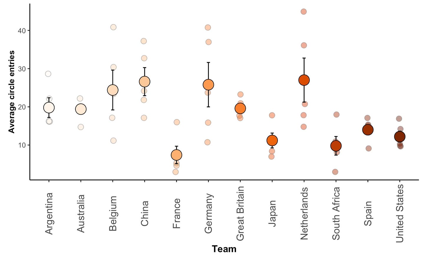
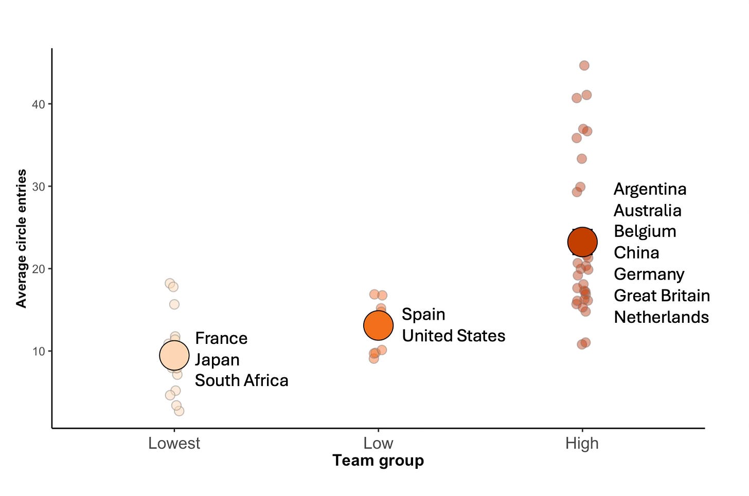
Not unsurprisingly Germany and the Netherlands, given the amount of possession they had, get into the circle a lot. Argentina are still there or there about, but are they still in the top group as they were for possession? And Spain have clearly dropped away whereas both Belgium and China have high number for circle entries compared to their ranking for possession. Again it’s good to streamline this overview to see which teams cluster together. When we do that we find there are three distinct groups.
The lowest group is again France and South Africa except here they are joined by Japan whose circle entry count was clearly poor. In the middle is a discrete little group of two now containing Spain. Despite being in the top group for possession Spain were significantly worse at getting into the circle than seven of the other teams, an indication of the limitations in their game. The top group is a slightly amorphous mix (see the spread of the points that make up their average) and contains teams that had high possession values (Germany and Netherlands for example) and those that had less than 50% possession overall in their pool games - noticeably China and Belgium.
Something is slightly squiffy here. Even though possession does largely explain circle entry (see Figure 3) there still seems to be some room for variation in how that possession is used to create circle entries. Luckily we can address that statistically. Not only can we simply compare the number of circle entries each team had (above) but we can also compare the circle entries for each team controlling for the amount of possession they had. It’s a sort of measure of circle entry efficiency. And because the answer is kind of froody I am going to inflict another table on you.
That possession is a significant predictor of circle entries is confirmed here (p = 0.006), the more a team has the more likely it is to get into that 7% portion of the pitch. But what is of real interest is that both Belgium and China are significantly better at getting into the circle than other teams when the amount of possession each team has is controlled for. In effect these two teams made up for their less than stellar possession values (whether those values arise because both teams are not good at keeping the ball or because they don’t care as much about keeping the ball is another question) by being more efficient at getting into the circle with the amount of ball time they had. Note here also that France was significantly different but unfortunately the other way. In this analysis an ‘Incidence Rate Ratio(s)’ less than one is the equivalent of a negative number that we saw earlier. France did not keep possession well and when they did have the ball weren’t very efficient at getting into the circle.
How to summarise this then? One might characterise two processes. One is based on propagule pressure which, simply put, means the more a team has the ball the more opportunities they have to bang it into the circle. Alternatively there is the more subtle, sneaker male approach, a maximisation of the limited possession resources available to those teams that don’t, or feel it unnecessary to keep the ball for any length of time.
Combining the two approaches might look something like this.
The values are the normalised product of possession and circle entries. Teams whose bar extends to the right of zero are better at getting the ball into the circle - via high possession percent, high efficiency with lower possession, or some combination of both - than those on the left of the line.
What’s interesting here is that the teams on the right side are all qualifiers for the knockout stages whereas teams that didn’t get out of their pool are not represented on the positive side. The only noticeable absentee is Spain who clearly struggle to be effective even though they were one of four teams in the high possession group.
Of note too is Australia. I commented in one of the Hockey Site talks that Australia were a bit odd, ‘weird’ is how I put it I think. Their pool results were good but the data suggested they were not pushing on from the solid platforms they built during games. At the time I queried whether the Hockeyroos were managing the game, deliberately not putting their foot down when they had control of the match. Afterwards I scolded myself for thinking this way. After all, who ever heard of an Australian side not going for the jugular. So here too I think was an intimation from the analysis that the Australians might struggle when it came to squeaky bum games.
Finally, one has to question Germany, a team that pre-tournament I thought might go all the way. They were the best team at keeping the ball and one of the best at gaining circle entries as well as having reasonable efficiency. Was it just the fortunes of war - a fourth quarter comeback by the Dutch, their one poor game of the tournament against Belgium (though note their circle entry efficiency in that game was about one every three minutes whereas the Belgians were at a very impressive circle entry for every minute of possession they had) and a last minute Jankunas penalty corner that took them to the shootout lottery in the quarter finals? Unlucky then? Perhaps, or perhaps their profligacy with possession in critical games (they dominated the Dutch 59% to 41% too) caused their undoing and a disappointing end to their tournament.
Finally, finally one must comment on the Dutch. Even in this little analysis of effectively two game metrics there is a signal in the data showing one aspect of what makes the Dutch so good. They keep the ball well, they create circle entries, but more than that, their p = 0.065 in the last analysis puts them only a whisker away from the same highly efficient group that the Belgian and Chinese teams characterised. Impressive.
For all these teams there will be other factors of course that influenced their Olympic performance - this is one simple look at two ubiquitous game metrics. To look at those other factors will mean entering the circle and seeing how the teams performed at the pointy end of things.


